
Client | OsasunKirol Salud y Deporte, SL
Project | Identity program
Samples | Logo, website, environmental graphics
Design & Art Direction | Lauren Hammond

Project | Corporate image
Sample | Logo
Design & Art Direction | Lauren Hammond
 |
|
Project | Corporate identity plan
Sample | Logo. Four versions with corporate colors. See Publishing section and Conference Identity for usage samples.
Design & Art Direction | Lauren Hammond
DIPC was created in April 2000 to promote scientific research in the area of basic and applied physics, focusing on the particular interest and needs of Basque society and an international scientific community. In 2010 DIPC celebrated its tenth year. This was an opportunity to create a new identity for the center.

Current project. To be updated.
Client |
Project |
Samples | Logo

Client | Micelio, Red temática Española de hongos filamentosos
Project | Group identity
Samples | Logo, website
Design & Art Direction | Lauren Hammond

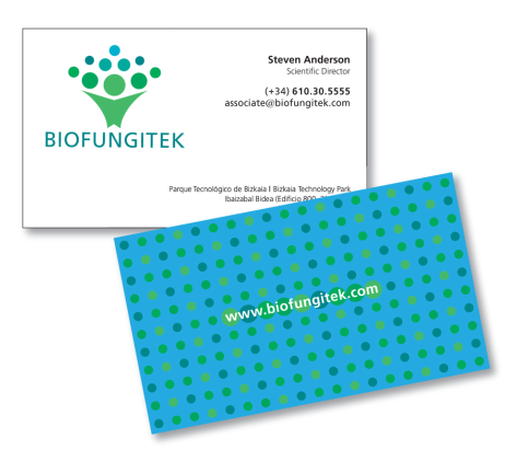
Project | Corporate identity
Samples | Logo, visiting card, website
Design & Art Direction | Lauren Hammond
The Biofungitek logo was created for a company which works on the development of fungi based products for crop protection. The products can be used by organic growers and their distributors. The color forms make an image directly related to fungi.
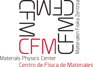
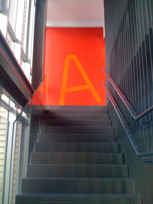
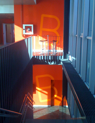
Client | Centro de Física de Materiales / Materials Physics Center / Materialen Fisika Zentroa
Project | Corporate image
Samples | Logo, environmental graphics for new facilities, Activity Report 2005-09 for 2010
Design & Art Direction | Lauren Hammond

Client | The Sutter Company
Project | Corporate image
Sample | Logotype, website
Design & Art Direction | Lauren Hammond
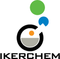
Client | IkerChem
Project | Corporate image program
Samples | Logo, website design and illustration
Design & Art Direction | Lauren Hammond
Website illustrations | Lauren Hammond
The IkerChem logo was created for a chemistry research group that won an award to start up a company based on its success in designing and creating synthetic molecules. The elements of the logo consist of solid color fields which intend to symbolize a flask and its possible contents entering, mixing and exiting the flask to create something new.
Client | POLYMAT
Project | Corporate image renovation
Sample| Logo with supporting text
Art and usage designs | Lauren Hammond
Design consultation & essays on renovation vs redesign by Lauren Hammond
The POLYMAT logotype has been renovated from a previous version. For information regarding the renovation, refer to documents: Renovation of the POLYMAT logo: Discourse, and Renovation of the POLYMAT logo: Discourse on Color Schemes. Please request by email
